
Red Peregrine 2.0
A lot more than a facelift.
Peregrine Falcon by Wallpaper FlareSkip Preface and Jump to the Post
Introduction
With all the drama of my life going on it’s been difficult to find the energy to work on my own projects. But as the multitude of challenges on my plate slips in and out of control I’ve recovered to the point I’m ready to start working on them again. I haven’t quite had the reserves to push myself into deep analysis or areas where large effort is required, so easing back into it with something familiar felt like a wise first step. When I discovered the technology I base this blog site on had moved forward 4 major versions from what I was using I began evaluating whether upgrading my site could be achieved with my tenuous energy levels.
Icarus is the theme of Hexo I use to create this statically-generated website. When I picked it up for my first post back in December 2017, Icarus was only on version 0.4 and yet still stood out to me as the most functionally capable choice of all the Hexo themes. It’s now 4 years on and Icarus continues to be a popular choice for people to create their own sites with.
With so many people consuming Icarus the developers have put in a lot of work. Not only does the 4.2 theme look great, it also make the features of Icarus (and Hexo) easier to use. As I browsed through Icarus’ showcase sites I realised what a breath of fresh air these improvements do to how an Icarus site feels. Comparing these showcase sites with my own site I could see how dated mine looked and I felt a little ashamed that someone with my talents ran a website that looked like it was written in the 1990’s.
So it was I decided to bite the bullet and commit to upgrading my site to Icarus 4.2. That’s 4 major versions of jump right there. As such I’m sure you can appreciate what a journey it’s been.
Strong Foundations
It’s been quite a few years since I’ve done any major web work. Web development is a field I’ve only spent a few years of my career in so I wouldn’t say I’m totally comfortable working with web technology. However the Hexo system is cleverly designed and makes things so simple; I can’t help but admire the architectural decisions the developers have made to make it so easy to consume and extend.
The prime example of simplicity is how posts are created using Markdown. This lovely markup language has become ubiquitous through engineering communities in the last decade or so. No matter your platform or tech-stack it’s virtually impossible to escape; it’s almost guaranteed some part of your engineering process uses Markdown. As a medium for writing documentation it is powerful and elegant, allowing content and structure to flow from thought to text with minimal friction. There are so many places Markdown is present in my daily technical operations that writing with it has become second nature.
Hexo also seamlessly integrates other markup types in your posts. For instance HTML markup can be used right alongside the Markdown. This allows the creation of structured content that Markdown alone does not provide. When you generate your site with Hexo it detects the change in markup language, interpreting the Markdown parts as Markdown and the HTML parts as HTML, leveraging the power of both to output the appropriate rendering. This frictionless extensibility makes Hexo powerful while remaining friendly to use.
Another markup type Hexo allows is Nunjucks. Nunjucks templates allow you to create extension points in your posts where javascript functions are executed at site generation time. Input is passed to the javascript function via arguments and content enclosed by the Nunjucks template, and the output of the function replaces the extension point described by the Nunjucks template. This extensibility means you can create reusable, complex components (such as that bodies of HTML content) accessed using succinct Nunjucks markup. Deeply complex scenarios are made possible with minimal distraction to your writing flow; complexity is abstracted away from your post while remaining easily accessible and feeling entirely natural.
Why are you telling me all this?
The fact that posts in a Hexo site are simply Markdown script with other markup mixed creates a loose-coupling between the site content and generation/delivery technology. This means makes the task of migrating or replacing the generation engine of your site to a different technology relatively straightforward. The confidence of knowing there would be minimal breaking changes to content of my blog site if/when I needed to migrate is one of the primary reasons I found Hexo so attractive in the first place.
As I began the task of upgrading through 4 major versions of the Icarus theme I was about to reap the rewards of this flexibility. Things had changed so much with Icarus I may as well have been changing my site generation engine altogether. Even though my web skills were a bit rusty, and even though Icarus had undergone many breaking changes, I could proceed with the upgrade with confidence.
Further, if anything went drastically wrong during the upgrade process, I could always roll-back my changes using git and recover simply, safely, and completely. The only risk in proceeding with the upgrade is whether or not I could complete such a large change with so many unknown challenges that would need to be resolved.
Peeking under the hood
Looking at Icarus 4.2 I could see its inner workings had totally changed since 0.4. First off, it had moved from using straight Stylus to the Bulma framework, leveraging this even higher level CSS framework. This has resulted in a much cleaner implementation of Icarus than I had seen before, allowing the theme to expose features in a far simpler manner. It did mean, however, that all the customisations I had made to Icarus 0.4 would no longer apply against Icarus 4.2 and would need to be recreated.
Determining what had changed wouldn’t be as hard as it sounds. When I built the first version of my site I had forked the Icarus project and configured it as a resident git submodule in my web project. All the customisations I had made to the Icarus submodule were in my own git branch on that fork. All I needed to do was to pull the latest Icarus commits into my fork, examine my branch for the customisations I had made, and recreate the customisation on a new branch off the latest Icarus commit.
As I recreated these customisations I would leverage the power of Bulma and the newer features of Icarus to my advantage.
Starting the upgrade
First thing I did was to go back to an empty Icarus 4.2 site with default _config files, no posts, and the minimal set of npm modules. Basically I ensured I could generate and serve the minimum version of my site locally without errors. My plan was to slowly add my posts back in, fixing and recreating my customisations as necessary. I kept a copy of my _posts folder on my desktop for easy re-introduction into this clean site using copy/paste. It felt good to be back at the minimum set of npm packages and to update them to their latest versions.
I then began hand copying back my site’s configuration settings (_config file content). While a lot of the properties were obviously the same and easy to transfer (title, description, author), there were a lot of new properties that I needed to identify what they were before tinkered with them. In this early phase of the upgrade I simply marked these new properties with a big TODO comment and would circle back to these properties once I had a sufficient amount of my content restored. The configuration of all the npm packages I had removed in the cleanup I copied back in and commented them out to remind me of what needed to be done before deploying the new site.
Site Header and Footer
Looking at the new Icarus the first thing I noticed was that the site name in the site header had change from a “logo with text” to a “single image” arrangement. This affords strong control over how the site name looks, helping set the tone of the site. After a period of musing I realised I wanted a hand-written style on the site name. After many hours struggling to use my own hand writing I settled on using Ink Free Font instead. I converted the text to curves and adjusted things until I was happy. I kept my diving Peregrine Falcon logo, though I did rotate it to steepen the dive angle.
![]()
The Icarus footer has changed a lot. Icarus takes the Creative Commons 4.0 license compliance set by Hexo seriously and shows links to the CC4.0 license, the license attribution statement (what it means to legally comply), and a link to the Icarus source Git repo. Because I was modifying the Icarus theme for my own purposes I modified the footer to remain in compliance.

Site font
One of the reasons why my original site looked so dated was because I used the default site font which had no character or life. I took a long time browsing through Google Fonts, searching for a something which looked good and conveyed the tone I wanted for my site. I found quite a few fonts that seemed up to the task but fell short on implementation. I found only one suitable font with the full set of weights I needed; Red Hat Display is a beautiful font that doesn’t strain the eyes when you read while having a friendly yet professional feel. It’s amazing how a good font can transform the feeling of your site and I am extremely happy with my choice.
Colours
I still really like the muted blue colour I chose for the background of my original site, and I kept it as I updated to Icarus 4.2. Icarus uses a nice blue as a primary accent colour which I continued to use unaltered in my new site.
Bulma introduces some lovely state colours (aqua info, yellow warning, red critical, etc) which can be applied to HTML components to change their flavour, though I did end up replacing these styles with modified versions of the colours from my original site.
The “more” button needed a lot of colour tweaking to fit with my site aesthetic, but was a simple styling exercise.
Inline code blocks looked plain wrong out of the box and were suitably tweaked.
Applying these types of colour changes were a simple matter of finding the CSS classes used by the newer Icarus and tweaking the values. More serious colour changes would come later on when I developed my customisations, but these simple changes would serve as a base for the time being.
Meta data
Icarus 4.2 also provides a number of additional page meta data options over 0.4. I settled for adding Google’s structured metadata, which should help the Google indexer process my site once I fix my broken SEO.
Widgets
Widget is the term used by Hexo for the block sections displayed on the left and/or right of the site’s main content column. I use most of the widgets that came with Icarus 0.4 and Icarus 4.2 has added a few more:
- A
Donation widgetlets you add buttons directing your audience to services that allow them to help pay for content. - A
Share widgetlets you add buttons directing your audience to share the post on social media. - A
Google Feedburner widgetallows your audience to subscribe to your feed and be notified for updates. - A
Google Adsense widgetallows you to host ads on your site.
All of these widgets are turned on by default. With the exception of the Feedburner widget, I didn’t desire any of them for my updated site so I turned them off. Unfortunately for me and other Icarus users, Google’s support for Feedburner was expiring. Attempts to ask the Icarus maintainers fell on deaf ears so I regretfully turned widget off too; I didn’t want to add a new feature that I wouldn’t be able to support within a manner of months.
Profile
With my widget selection configured I moved my attention to the configuring the Widgets I had kept. I really like the updated style of Widgets; the addition of rounded corners, the default capitalisation of headers, and the use of Bulma tags in the Tags widget. However the Profile widget needed serious attention because the spacing and size of elements was really poor and the “follow” and social media buttons were tiny once I got all my configuration in there.
It wasn’t too much work to get a result I was happy with, though I am still surprised how the default look of this particular Widget is so unbalanced when compared to the other Widgets in the Icarus box.
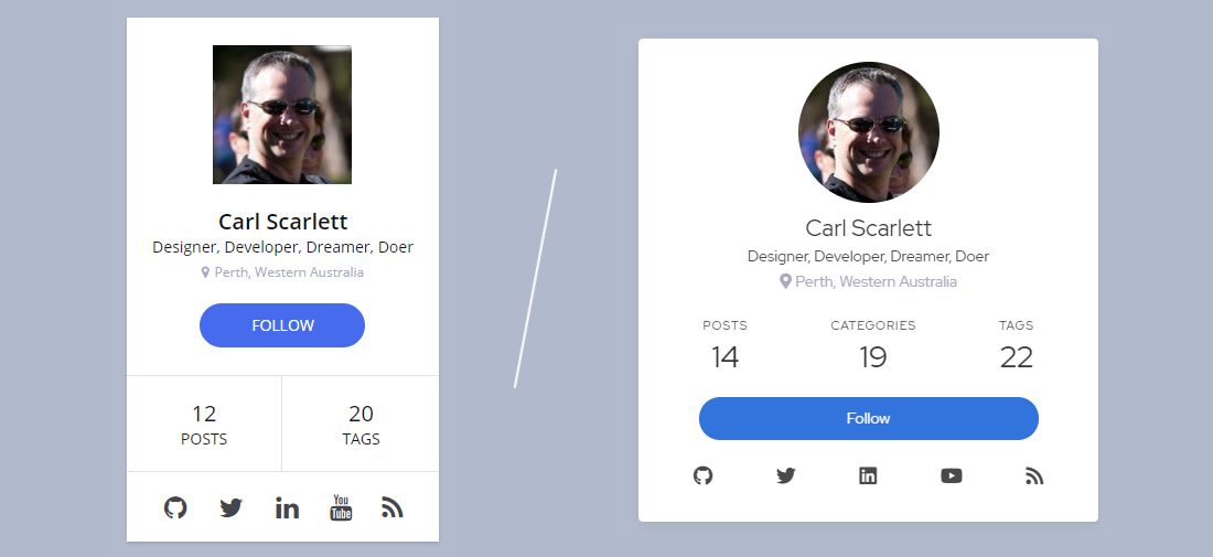
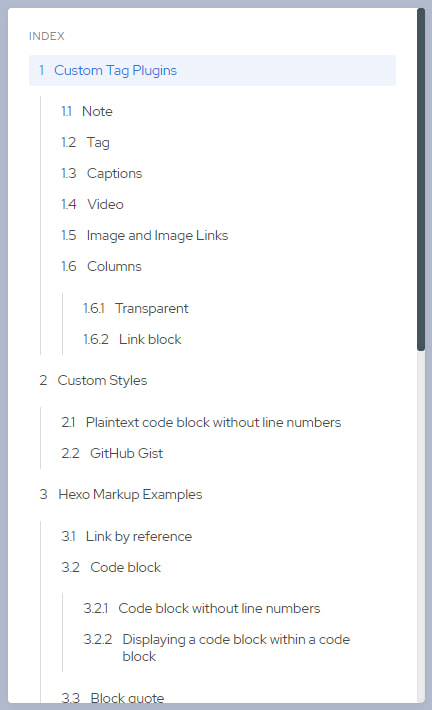
Table of Contents
Despite it being one of the most desired features I wanted for posts in the first version of my site, I never figured out how add a table of contents to each post. The Hexo documentation is unclear on how to use/apply them but the improved clarity of the Icarus 4.2 config file put me on the right path this time around. One simply adds toc: true to the front matter of each post to turn this widget on for that post. I have now added toc: true to the scaffold used to generate new posts, and would add it to my old posts manually as I restored them.
The formatting Icarus 4.2 applies to the table of contents is lovely but I still needed to apply a few tweaks:
- I wasn’t happy with the caption of “Catalogue” so I changed it to “Index” in the English resource file.
- Some of my posts were so long the table of contents would run off the bottom of the screen. Given this widget scrolls with the page content this created a less than ideal reading experience. I used CSS to add a maximum height and overflow to the TOC HTML element, forcing a vertical scrollbar to appear when it was too long to fit comfortably on the browser window.
Restoring the Posts
Now the framework of my updated site was in place it was time to start bringing back my post content one by one and fixing anything that was broken. Because my first ever blog post contains a lot of mixed content types I felt it was the ideal candidate to restore first.
Copying that first post back into my website project and generating the site revealed compile errors where Tag Helpers were missing. This was expected; having stripped back to the minimal set of npm modules I knew there were things previously provided by those npm modules that were no longer installed. The errors highlighted which Tag Helpers I needed in order to get that first post working again.
Because this was my second build of my site (my first rebuild if you prefer), I was more familiar with how Hexo works. Where previously I was desperate to get my site up so I could start blogging as soon as possible, this time around I decided to focus more on polishing the look of the site. This decision gave me the time and space to to flex my engineering muscle and create my own Tag Helpers, rather than take dependencies on external ones from npm. This approach adds the benefit of making the site content more flexible should I need to do other site upgrades in the future.
After building custom Tag Helpers so that first post would generate, ensuring all the content of the post was showing, and tweaking my Tag Helpers so that everything looked good, I had successfully restored my first page to the new site. This proved my restoration approach worked and I fell into a pattern of restoring my posts one at a time from oldest to newest, creating new Tag Helpers as I required and extending existing custom ones to fit changing use cases.
After many iterations of restoring, coding, updating, and verifying each post I had finished re-importing all my content. It was a lot more work than I had anticipated (and subsequently took a lot longer than expected), so I felt it warranted a post of its own (this one!) documenting the experience and sharing what I’ve learned.
Custom Tag Helpers
Speaking of sharing, let’s talk about all those custom Tag Helpers I made along the way. While it would have been easier to restore all the additional npm modules I had added on my original site, I’m very glad I decided to take on building these extensions as Tag Helpers myself. I was never comfortable with the lack of flexibility due to my dependence on them, and I didn’t want the overhead of going through the contribution process for the many small changes I wanted on so many small components. Sometimes I wanted dynamic control over leading or trailing space, sometimes I wanted different colours, sometimes I wanted more control over the functionality they provide. I am much happier having complete control over these components within my own repo, and enjoy not having so many npm modules cluttering up my site project.
As mentioned earlier, I created and extended these Tag Helpers as I restored each post. The following sections show the final version of each Tag Helper once I had restored all my posts and written this one. Tag Helpers are listed in the order of importance to my site from most important to least.
zodnote
I use note blocks proliferously in my posts. I use them to give the reader a place to rest after reading paragraphs of intense content, or for information that’s not entirely on point to the thread of the post at that moment. Previously I used the hexo-tag-admonition plugin to create these blocks, but now I wanted to have more control over the structure by leveraging Bulma and Icarus, and over colour variants using CSS.
First I created the appearance I wanted directly in a post using HTML. I combined the Bulma Message component with a Bulma Tag element to form a note block with a header tag. I then added the message-immersive class I had seen used in Icarus documentation, which pushes the note to the full width of the column.
With the HTML structure working I then created a zodnote Tag Helper script to output that structure. I added a parameter for base colour selection and allow the remainder of the parameter section to be the text of the Tag Header. For the base colour parameter I allow key words that map into Bulma colour modifier classes which I apply to the Message HTML element (<article>). I style these colour modifier classes to match my personal preferences in the web site’s article.styl Stylus file.
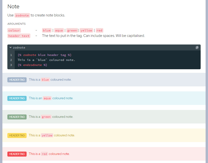
zodnote usage (taken from my private Style Guide page)
Here’s the code, including extracts from the style files to get the colours how I like them:
zodtag
I created the zodtag Tag Helper after seeing how the Icarus documentation gives credit to photographers when using their images. My previous approach was ugly in comparison so I blatantly stole the idea and formatting from Icarus and rolled it into a Tag Helper.

photo credit: old vs new
In recent times I’ve taken to adding Preface sections to my posts as a space to share personal messages from my life at the time of writing. These sections can be quite long, aren’t important to some readers, and can otherwise get in the way. I added a skip variation to zodTag to gracefully allow readers to skip over the Preface and jump straight to the content of the post.

Finally, I needed better control over the space between zodTags and the HTML bordering it. I added a few parameters to modify the top and bottom margins. These parameters allow either a Bulma spacing helper of mt or mb, or normal style value such as 1.7em.
zodimage
You’d think embedding images were a long-solved problem in Hexo and you’d be right. Before upgrading to Icarus 4.2 I used Markdown syntax to create the images and image links in my posts without an issue. However after upgrading Icarus I noticed a few problems; image captions no longer supported embedded Markdown and image links did not work at all. My response was to create a Tag Helper that encompassed all the image functionality I need.
For basic image use I need only provide the image URL to my zodimage Tag Helper. This could be a filename local to the post, a relative path reference within the site, or a full URL for references to other sites. The image comes with a default maximum height to accommodate large images without disrupting the flow of the post.
For image links I allow the image URL and a navigation URL to be provided. When the reader taps the image they are navigated to this second URL. I mostly use this arrangement for providing links to my GitHub Gists when sharing code there, and have a standard image and caption for this explicit purpose:

Speaking of captions, zodimage also support captions with Markdown. I typically use this when referencing code symbols in the caption. On rare occasion I also use hyperlinks within the caption, though for technical reasons I have to use HTML <a> tags in order to achieve that:
Finally, zodimage allows control over image height, spacing between surrounding HTML, and spacing between the image and the caption. All of these are optional but are sometimes required to create a more appropriate layout than the default values provide.
Here’s the code:
zodcaption
For those times where I want to add a caption to miscellaneous content (such as some custom HTML or a code block) I created a stand-alone caption Tag Helper. As you’d expect I style it like the caption content from all my other Tag Helpers and support Markdown and HTML links. I allow optional modification of the space above and below the caption to suit all manner of scenarios.
zodvideo
Prior to upgrading Icarus I was using the npm library hexo-tag-owl to embed links to YouTube and Vimeo videos. Now Icarus provides that support out of the box. I usually (always?) add a caption to my embedded video, so rather than using two Nunjucks tags to embed a video and caption separately I rolled them into one Tag Helper for convenience. Simply specify the video platform, the Id of the video, and a caption, and I’m free to quickly keep writing my post:
zodcolumns
The final Tag Helper I created is a bit of a doozy; it produces the most complicated HTML of all my custom Tag Helpers. The zodcolumns Tag Helper allows me to create tables of content occupying the width of the post column. The number of rows and columns is inferred by the content, and I allow an optional background colour. Title rows can also be embedded:
ARGUMENTS
colourtypeurlmt:xmb:y-
-
-
-
black | greenphoto | skipan optional link
optional top margin where x is a size or an
mt Bulma spacing helper (mt-[1,2,3,4,5,6])optional bottom margin where y is a size or an
mb Bulma spacing helper (mb-[1,2,3,4,5,6])zodcolumns used to describe how to use the zodtag Tag Helper on my private Style Guide page
Basically zodcolumns is a wrapper for Bulma Columns elements, which is an arrangement of class-marked divs styled into columns and rows using CSS. I use the is-narrow columns variation which aligns all the columns I specify to the left hand side.
I allow special delimiters in the content of zodcolumns to indicate the start of a new column (/) or a title row (/title). Line feeds determine the number of rows in the column. Title rows aren’t actually part of the table, they’re just a <p> block above the table which I’ve styled to look the same as headers in Icarus widgets.
1 | {% zodcolumns %} |
The zodcolumns definition for the above example. Pretty simple right?
The real reason I made this Tag Helper is for displaying links to other posts in a series of posts. For these I colour the table using the optional colour parameter, and use multiple title rows to carve up the table into relevant sections. The result is a professional looking block in my posts that feels right at home among the other components and widgets provided by Hexo and Icarus:
Swish! The zodcolumns table used in part 3 of my series on Building a Pause Menu in Godot
Compare this to how I used to display these links; there’s no question that using zodcolumns is more visually appealing:

You might think the code producing all this would be complicated but it’s actually very simple. Most of the functionality is provided by Bulma. I simply deparse the content and convert it into <divs> with appropriate class properties. The magic of CSS does all the rest:
More about Icarus
Apart from new widgets and components, Icarus 4.2 provides a lot of other plugins out of the box. Let’s talk about these other features I use.
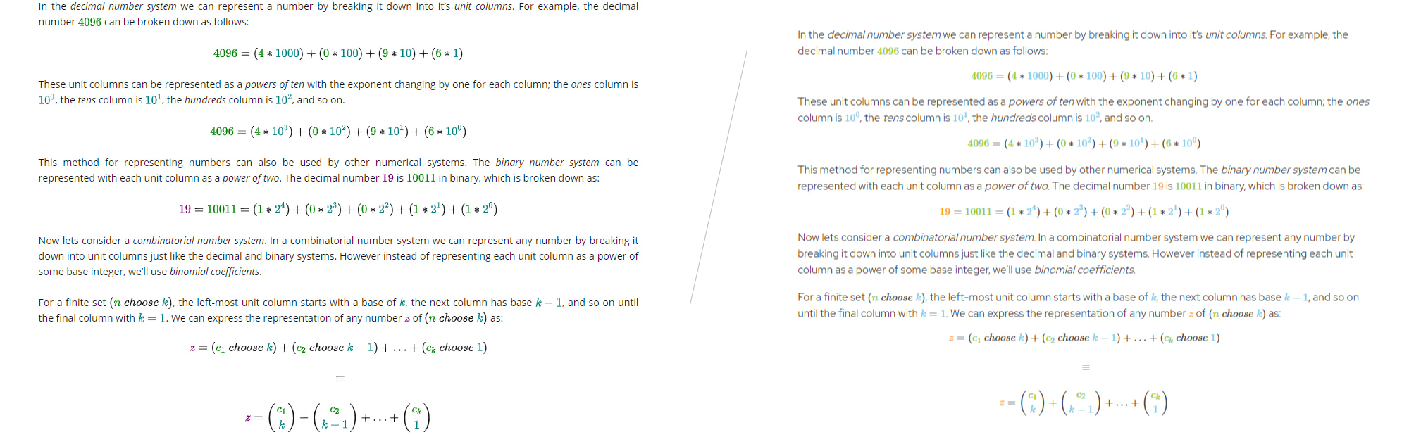
MathJax
While I originally installed the hexo-filter-mathjax npm module for my math-heavy article on k-combinations, Icarus 4.2 comes preloaded with MathJax pre-installed. Rather than have two MathJax libraries in my site I decided to try rolling with the version bundled with Icarus to see if it would support what I needed.
I did notice some minor differences right away when converting my k-combinations post. I had to modify my textcolor tags down to color tags to get the inline colours working again. The colours on the Icarus plugin are more muted than with hexo-filter-mathjax so I switched colours altogether. Icarus MathJax is a little more compact than before, and feels very much at home with my new font choice.
I find I prefer the Icarus version of MathJax:
There is a drawback to relying on Icarus for MathJax; you have to turn on MathJax support at the site level rather than the post level. That means every post on the site loads an additional 128kb of script MathJax script, whether you use it in the post or not. 🤨
Worse, the MathJax script can match content as MathJax even when you don’t want it to. This means I had to recheck the content in all my posts to ensure MathJax didn’t mess anything up. Fortunately I found only the GitHub Gists in this post were affected. Thanks to help from the folks who maintain Icarus I was able to wrap the affected content in a div tag and instruct MathJax not to process it.
1 | <div class="tex2jax_ignore asciimath2jax_ignore"> |
No MathJax is applied on this Gist! 😊
Personally I would have preferred if MathJax was opt-in on each post it was required for by using a directive in the front matter. I may also have liked to provide special <div> content to instruct the MathJax script which content I wanted processed, rather than the opt-out option provided by MathJax. Once I deploy the new site I will be watching the impact on my Google rankings closely, once I get back in the index of course. 😞
Column Widths and Media Queries
Icarus implements a 12-column grid layout, dividing the usable space on the web page into 12 available columns. It then provides configurations for both 2 and 3 column posts where the widgets can be located on one or both sides of the post column. This is a widely adopted standard and allows software engineers to create adaptive content layouts with minimal complexity. However when it comes to changing the size of those columns in Icarus things get a little tricky.
My site uses a 3-column layout (widgets on both sides) and my posts are a wordy enough to look uncomfortable in the space afforded by the default layout on wide screens. It took me a long time to figure out how to make the center column (the post content column) wide enough to feel comfortable on widescreen displays, stay centered on the screen horizontally, and still allow the page to responsively rearrange itself on smaller screens (like tablets and laptops).
At first I thought changing the CSS column class generated into the post was what I needed to change. I fiddled with these classes in layout.jsx and widgets.jsx but things seemed to skew towards one side of the page instead of staying centered. It was then that I realised Icarus 4.2 is missing the 3-column layout code media queries for larger displays:
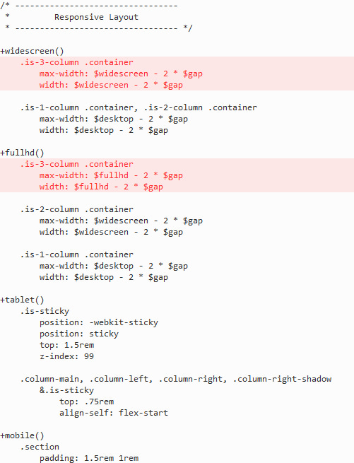
Git-diff of the missing 3-column states
This helped align things centrally again, but the post column was too small. I needed to tweak the default media query breakpoints set by Icarus to get things to work like I wanted. The default values look strange to me, and the size I set for fullhd is how I tweaked the size of my post column to look how I wanted on a widescreen monitor:
1 | $gap ?= 64px |
Original/default breakpoints are shown as comments
Style Guide
With all this customisation going on it was becoming difficult to maintain documentation on how everything worked. Where previously I was using a private readme.md to keep a reference for the syntax for all the different Nunjucks and HTML hacks I use to create posts, I was struggling to use Markdown alone to document and demonstrate the syntax correctly.
I decided to create a Style Guide page as a draft post to document everything effectively. As a draft post I can generate and serve the Style Guide page for reference while I’m creating content and generate the site without it when deploying the site for public consumption.
The main benefit of using an actual page for the Style Guide is that I can demonstrate how things look visually when they are used in a post. This really helps organise the information effectively, as well as making things much easier to find using either the scrollbar or the Table of Content.
Unfortunately, as a draft post, I can’t give you a link to the page to peruse. Sure I could deploy the page as a normal post but as it has nothing to do with my blog content-wise I don’t want that. You’ll just have to drool over this video of me scrolling through the page to get a feel of how useful it is to me:
A video walkthrough of the Style Guide page
Conclusion
Hexo is delightfully extensible and Icarus is a solid foundation for creating web sites. Upgrading Icarus through 4 major versions to 4.2 was relatively simple. I’ve shared a lot of the major changes I’ve done on top of Icarus such as Tag Helpers and CSS. In addition I’ve made a bunch of minor tweaks which I haven’t blogged about here, but everything combines to making my site look great and I’m a lot happier with how the site looks now.
Further, I have the tools to create content with even less disruption to my writing flow than ever before. I’m very glad for choosing Hexo and Icarus and look forward to creating more content with this new setup.
As usual, here’s the Gist containing all the code from this post:

Don’t forget to check out the delicious new Icarus 4.2 post footer below. Yum!
Red Peregrine 2.0